Give it space.
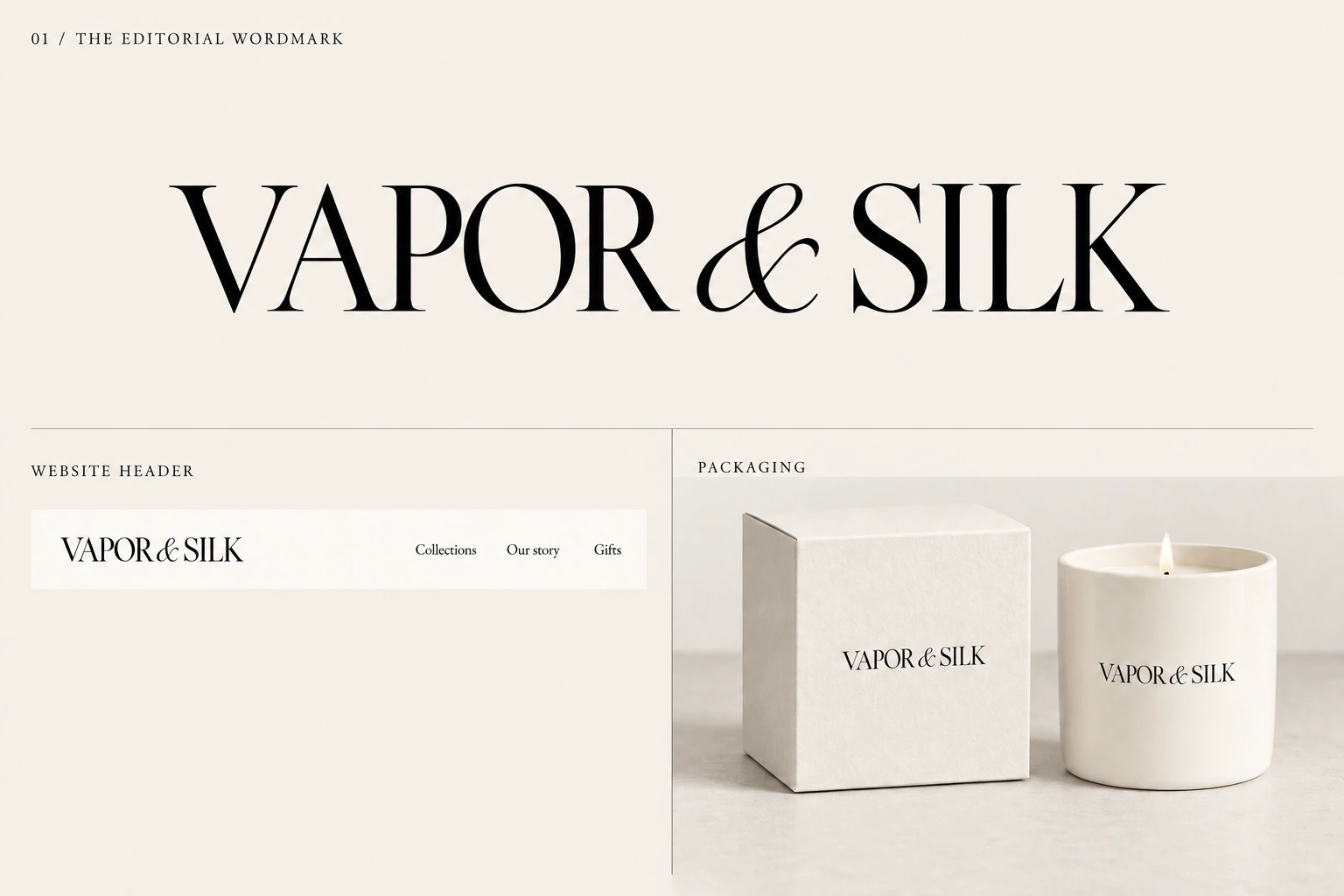
Proposed rule: leave at least the height of the capital V around the wordmark. Keep text and edges outside that space.
THE HOUSE / VISUAL IDENTITY
In development · Edition 02
Packaging direction set; logo, colours and physical specifications remain open.
01 / EXPLORE
Choose a logo and palette to compare their character across a website header, candle vessel and gift box.
02 / THE MARK
The website uses a working wordmark. The five proposed identities remain open for selection.
VAPOR & SILK
VAPOR & SILK
Proposed rule: leave at least the height of the capital V around the wordmark. Keep text and edges outside that space.
Start testing at 160 px wide on screen and 35 mm in print. These are review sizes, not approved minimums. Use a simpler mark when small lettering becomes unclear.
Preserve proportions and spacing. Use one ink colour. Avoid stretching, outlines, added shadows or placing the logo over busy imagery.
Standalone symbols, optical sizes and final vector artwork will follow the logo selection.
03 / COLOUR
The house palette anchors the website. Collection colours give each expression its own character. Select any swatch to copy its HEX code.
HEX codes are for screens. Match inks, paper and ceramic glazes using physical samples.
Use dark ink for body text on a light ground. Reserve blush, champagne and celadon for larger surfaces and accents. No Pantone or CMYK matches have been approved.
04 / TYPOGRAPHY
The website pairs expressive headings with clear, simple reading text. Logo lettering is a separate design decision.
Designed to be felt.
For large titles and product names. Let the letters breathe.
A sculpted flower. A quiet corner. A little beauty for the everyday.
Body text: 16–18 px. Useful labels: 14 px or larger. Keep longer passages in sentence case.
For the moments in between.
Use a short phrase for emphasis, with restraint.
Flowers, reimagined in wax.
Explore the collectionVAPOR & SILK
Sculpted wax candle
Proof actual print sizes on the chosen stock. Product facts and care information need a separate, readable panel.
05 / MATERIALS & PACKAGING
A structured box, a soft wax tulip and a deliberate reveal. Luxury comes from paper, weight, proportion and craft. The packaging is the first physical expression of “Designed to be felt.”
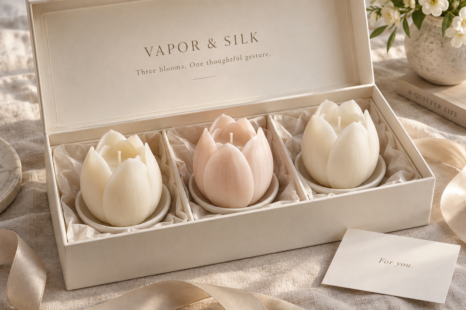
The tulip is sculpted wax, not a ceramic vessel. Single Bloom and Three Blooms may include separate holders; Tulip Garden sits in glass. Support the base or vessel without putting pressure on petals.
Lead with oxblood and a pale interior. Sample ivory as the alternative, then select one core exterior for launch. Keep existing collection palettes as explorations; do not assign a new outer colour to every scent.
Textured uncoated wrap, blind-debossed logo and one ink colour. No foil on the main logo for the first version. Place a scent accent on the inner tray or a small label, in no more than two places.
| Format | Proposed structure | Support to prototype |
|---|---|---|
| Single Bloom | Compact two-piece rigid box with lift-off lid. | Base-supporting paper cradle; a separate recess for the holder if supplied. Leave clearance around every petal. |
| Three Blooms | Wider lift-off box; three blooms revealed together. | Three separate recesses that prevent movement and contact between flowers. Secure each holder independently. |
| Tulip Garden | Top-opening lift-off box sized to the full arrangement. | Support the glass at its base and sides; keep the lid and upper support clear of the wax flowers. |
| Component | Starting point | Confirm through samples |
|---|---|---|
| Outer box | Rigid board wrapped in textured uncoated paper. Explore 1.5–2 mm board as a starting range only. | Thickness, box dimensions, weight, corner quality and lid resistance against the actual packed product. |
| Logo & print | Blind deboss plus restrained single-colour print. No printed imitation texture. | Small lettering, stroke clarity, impression depth, ink coverage and rub resistance on the chosen wrap. |
| Insert | Compare folded-board cradle, moulded paper pulp and two-part paper support. | Movement, compression, wax scuffing and easy removal. No pressure on petals; prefer no visible plastic or permanent foam. |
| Protective layer | Glassine or minimal uncoated tissue only where needed. | Wax and fragrance contact, staining, abrasion and removal. No loose decorative filler. |
| Printed cards | Two uncoated cards: combined brand/scent story, plus care. | Readable print and room for a personal note on the story card. No separate brand card. |
| Shipping carton | Corrugated board with paper-based transit protection. | Glass, wax and presentation box protection together. Confirm recycled content and local recycling guidance before making claims. |
Shipping carton → product box → lift-off lid → pale interior and story card → wax tulip → care card.
Prototype a smooth lift with slight resistance and an easy way to remove the candle using its base or holder. Avoid ribbons, extra seals and layers without a clear purpose.
Front: wordmark, product or scent identity, then only essential secondary text. Keep generous space around each element.
Side or base: confirmed product facts, care and safety information, batch details and required market-specific labelling. Do not print placeholder scent notes, weights or burn times.
Story: “Designed to be felt. Fragrance, light, material and memory — created for the way a home feels.” Add the confirmed scent story and space for a personal message.
Care: format-specific first use, wick care, safe placement, burn duration, extinguishing and disposal. Final instructions must follow burn testing of the actual design.
Prioritise paper-based parts, limited ink and a box worth keeping. Use common materials across the range with inserts fitted to each format.
Magnetic closures, foil accents and ribbon are reserved for later gifting explorations. Reuse and recyclability are design goals, not approved product claims.
Review paper swatches and deboss test strips, an unprinted structural sample using exact product dimensions, then a fully finished sample. Check lid fit, colour in daylight and artificial light, rubbing and repeated opening.
Test the complete packed product for drops, vibration, insert compression, heat and humidity. Confirm that neither the wax nor the glass is damaged and that the presentation survives shipping.
Request comparable quotes at 100, 500, 1,000 and 5,000 units, separating tooling and sample costs. Confirm minimum quantities, lead times, tolerances, damaged-box replacement terms and material/recycling details.
Working direction, not a production specification. Exact dimensions, board thickness, cradle construction, lid fit and colour remain provisional until physical testing. Approve packed samples, not renders alone.
View the packaging story ↗06 / WORDS & IMAGES
Describe what people can see, touch and feel. Use simple words, short sentences and specific details.
Vapor is the part that fills a room. Silk is the part you can touch. Together, they bring atmosphere and texture into the home.
A sculpted wax flower on a simple ceramic holder. A little presence for a quiet corner.
For a new home, a thank you, or no occasion at all.
Avoid empty superlatives. Only state materials, fragrance notes, burn times and origin once they are confirmed.
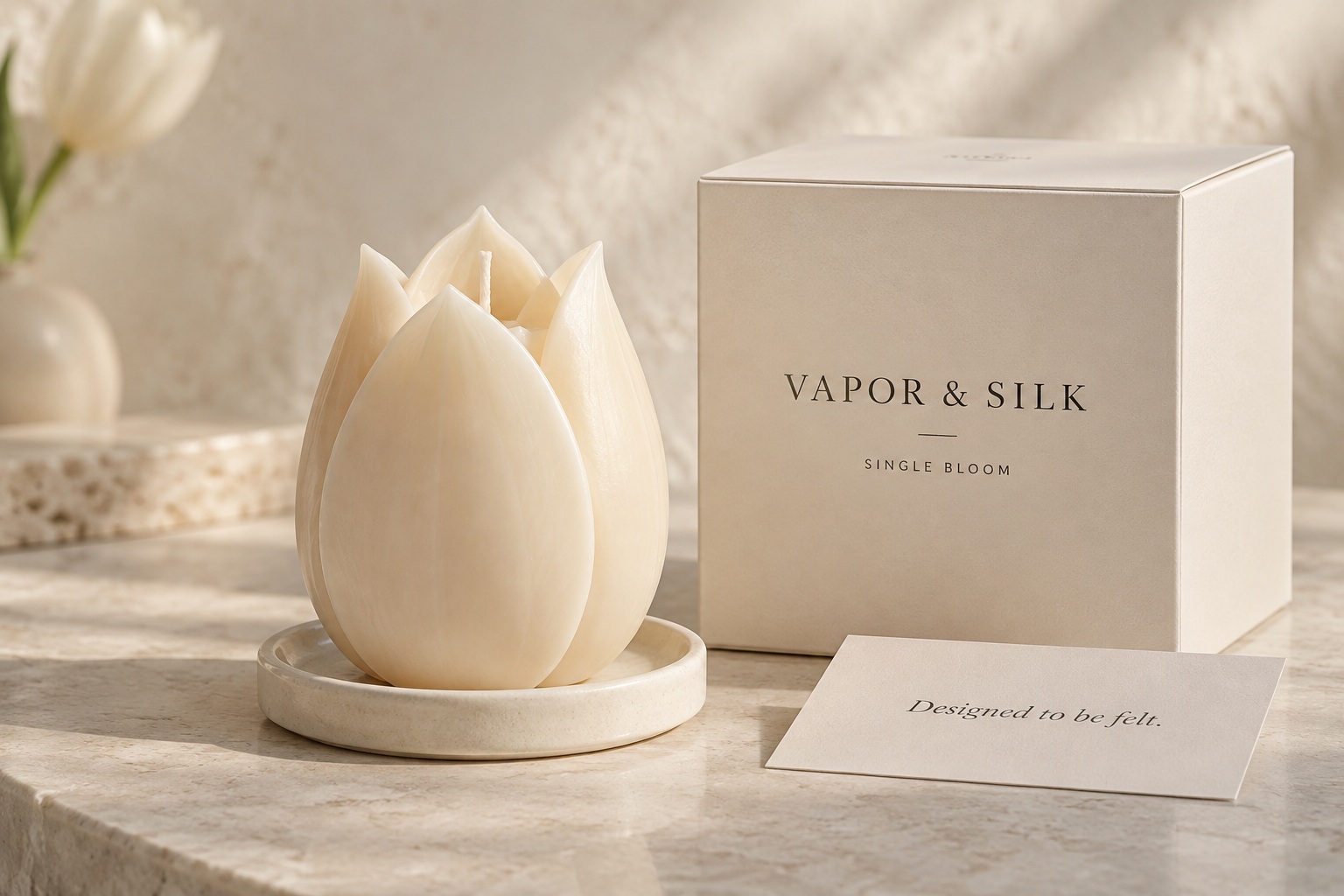
Soft side light. Natural shadows. Enough space to notice the form.
Use warm, quiet backgrounds and a few purposeful objects. Include close views of real texture and keep colours consistent with the product.
Current collection imagery includes illustrative concepts. Final product photography should reflect the goods customers receive.