VAPOR & SILK / THE IDENTITY
One name.
Five expressions.
Five explorations of our visual identity, shown across the website, candle vessels and gift packaging.
Design concepts for review.
01 / LOGO DIRECTION
The Editorial Wordmark
A refined serif wordmark with a flowing ampersand. Quiet, confident and made to last.
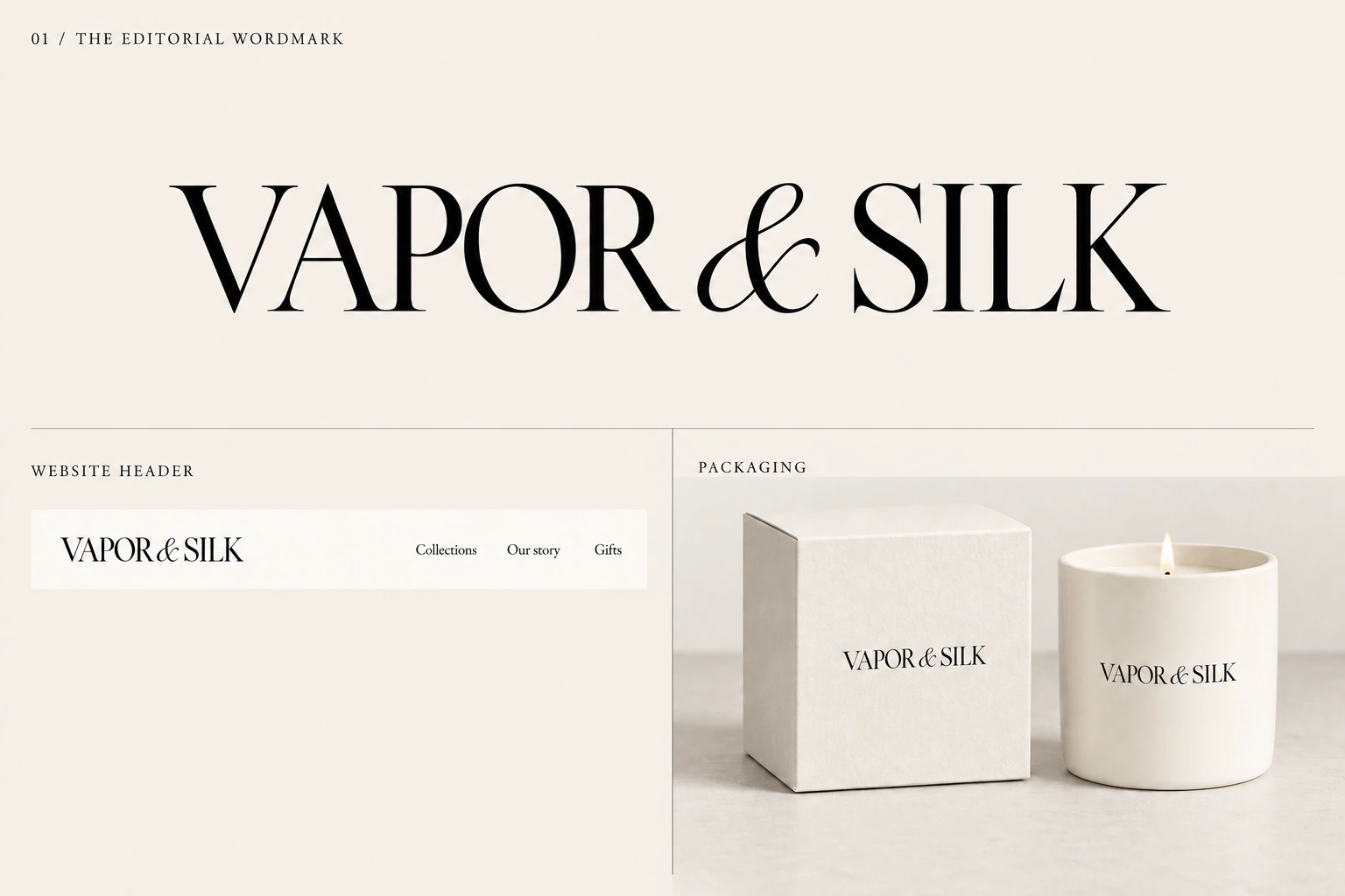 View full-size board
 02 / LOGO DIRECTION
The Silk Ampersand
A ribbon-inspired ampersand paired with simple lettering. A symbol that can stand on its own.
 View full-size board
 03 / LOGO DIRECTION
The Sculpted Monogram
An interlocking V and S. Sharp lines meet soft curves in a compact brand mark.
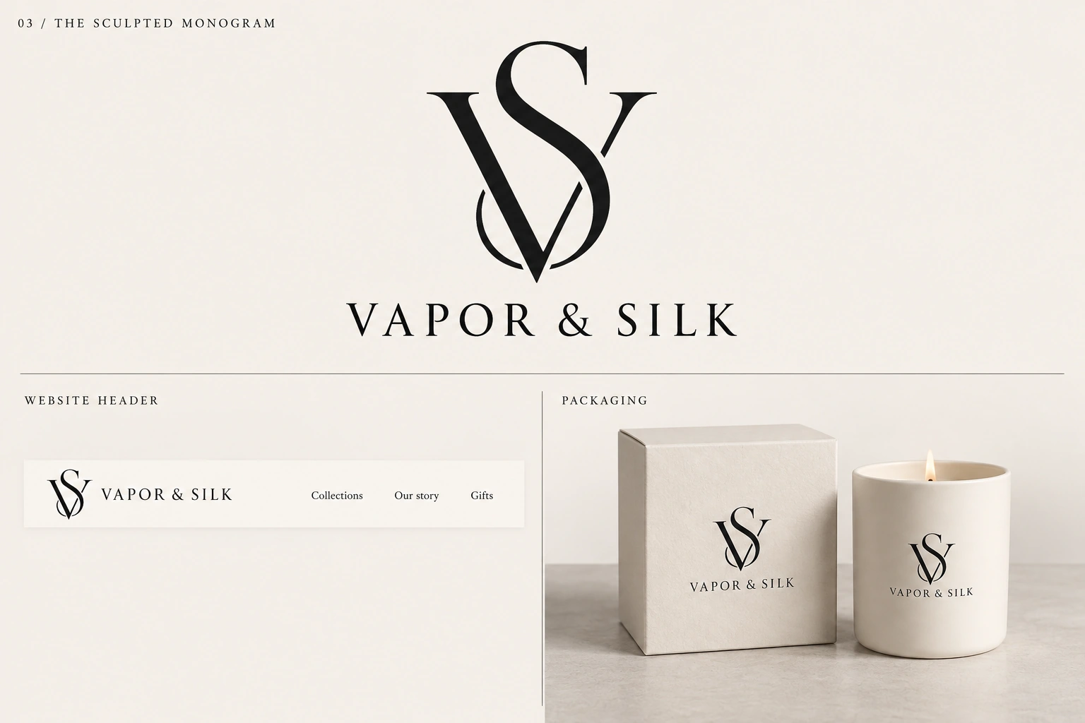 View full-size board
 04 / LOGO DIRECTION
The Tulip Signature
A tulip emblem with a subtle V in its petals, inspired by our sculpted candle collection.
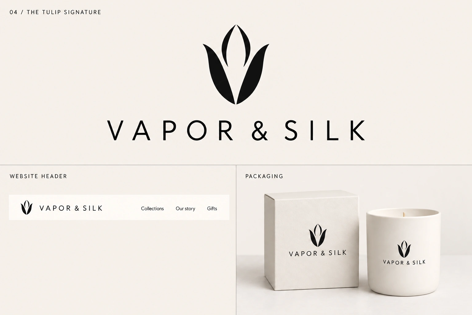 View full-size board
 05 / LOGO DIRECTION
The Split Character
Airy lettering for Vapor. A flowing serif for Silk. Two textures, brought together in one name.
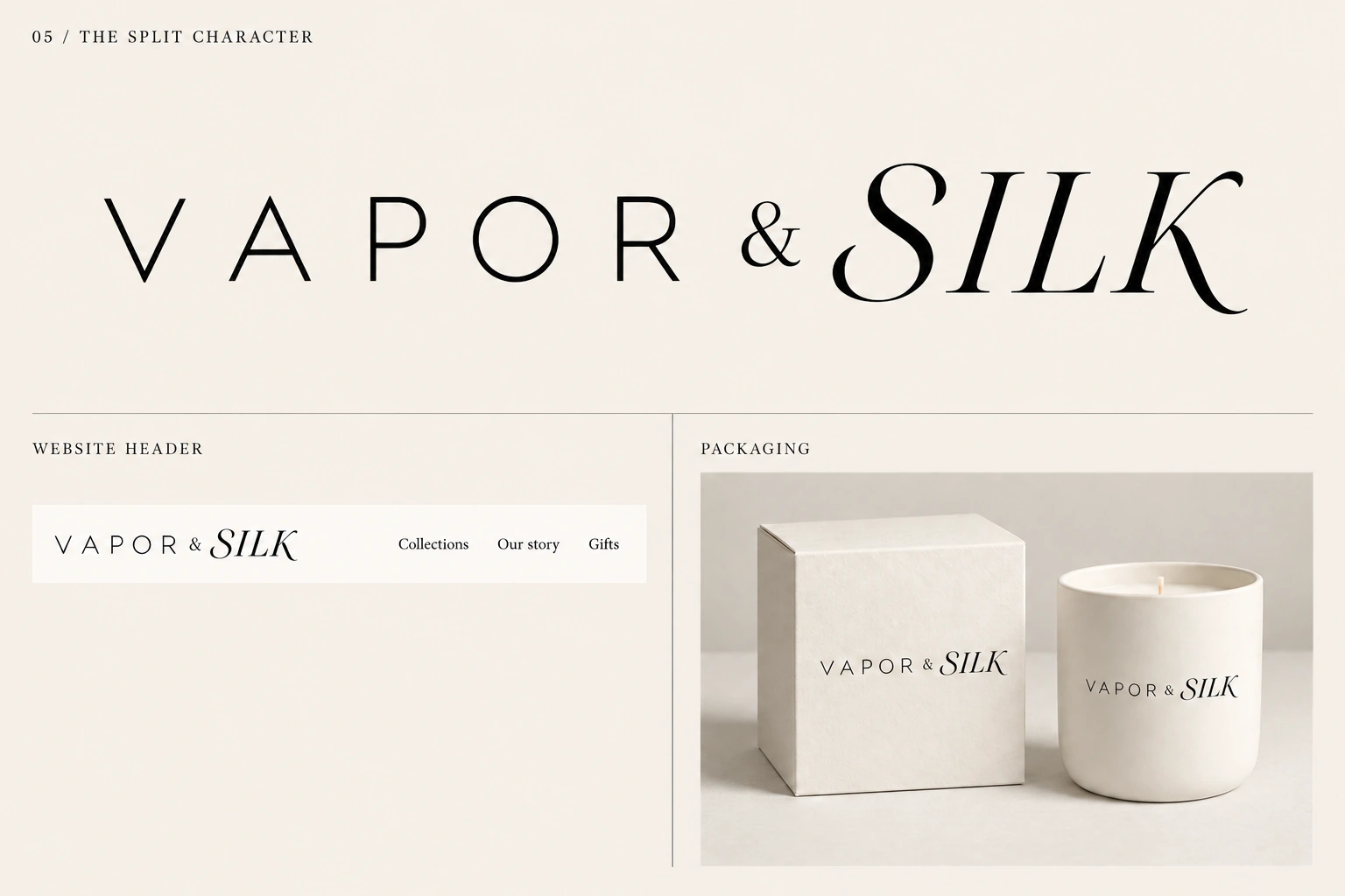 View full-size board